I like these flowers assembled for my mother-in-law's memorial service.
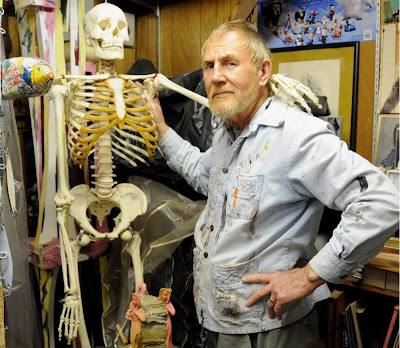
Our friend Joe Nyiri is a Wisconsin-born but San Diego-loving artist who has had a long relationship with the San Diego Zoo. He paints, sculpts, welds, and plays tennis. Here he is showing his customary attitude towards the world.
We got our first Nyiri artwork by accident - won in a raffle at my wife's school. Joe had donated this piece for the school's annual fundraising campaign. I had no idea what it was about. I wasn't sure I liked it. I tried to give it back.
But we took it home and hung it up in the bedroom. When I get that feeling "I'd rather gouge my eyes out than go to work, or do the dishes, or ..." this painting makes me think twice. "No, eye gouging won't help."
Then the Crow, I think, chosen primarily for the explosive orange-red. I don't really like crows, but lots of visitors to our
The Berkshire Pig was painted outside a field where the "model" pig resided. This was purchased for the yellow-orange tones, and his thoughtful eyes and set of his mouth and chin.
This Dog is named Iris. It looks like a Dingo to me, and it's not afraid to stare right back at you without giving away a clue as to its thoughts about you.
I like the bright green tones of this Cow and its friendly face.
These are baby Cooper's Hawks. Joe painted a whole series of Cooper's Hawks as a memorial for the parents of a young boy named Cooper who died recently.
These two Crows were our most recent purchase - chosen primarily because we liked the way Joe painted the branches down and over the edge of the picture frame, and secondarily because they would fit nicely at the top of our collection. We're almost scraping the ceiling, but that's ok with us.
The collection looks approximately like this today. We have it in our main hallway so we can enjoy it as we run up and down the hall. It's hard to get a photo of all the pieces together because you can't back away enough, even with a wide lens. (The painting of two birds looking down was taken back and traded in for a new image.)
As you can see, we have a wide range of colors. Since the color tones run freely up and down and across each painting, I have enjoyed the challenge of moving them around in this composition - to get a mix of vertical and landscape formats as I blended the colors and shapes across the whole wall.
I used to hang it at my office, but some ladies complained that it was too spooky - glaring at them all day - so we brought it home. It's 20 x 30 inches and has real presence.
It shows everything they could do wrong (incentive to fool around, I think). It's been hanging directly across the room from my desk for the last 10 years.
We have another 50 or 60 pieces of art that do not have bright colors. I'll get to them someday soon.


