Friday, February 3, 2012

Bright Colors, Part III

My second post on bright colors involved putting fruits and vegetables on the white Corian kitchen counter. It made me hungry.

You should not that some things that appeal to me visually are not edible. For example, here's a bottle of Chambord-infused vodka. It's actually filled with colored water now, since the liquor is long gone. [click any image to enlarge]


Not all items have to be photographed on our white Corian counter, otherwise we'd never get dinner ready. So this group of cobalt blue glass is in the living room. I washed and dried most of these pieces in preparation for the photo, because the camera is merciless at exposing lint.


There are a couple of vases, a superb wine bucket I bought at a thrift store about 10 years ago, some candle holders, and a flattened blue wine bottle given to me by my brother Brian.


Note: When I was researching the meaning of "curating" I used the old Webster's Third International Dictionary (unabridged). I have a Second Edition too, somewhere. While flipping through pages looking for Curate, I saw Cobalt Blue. Did you know there is a Cobalt Green? Direct random-access-searching is not always preferable to browsing! [click to enlarge]


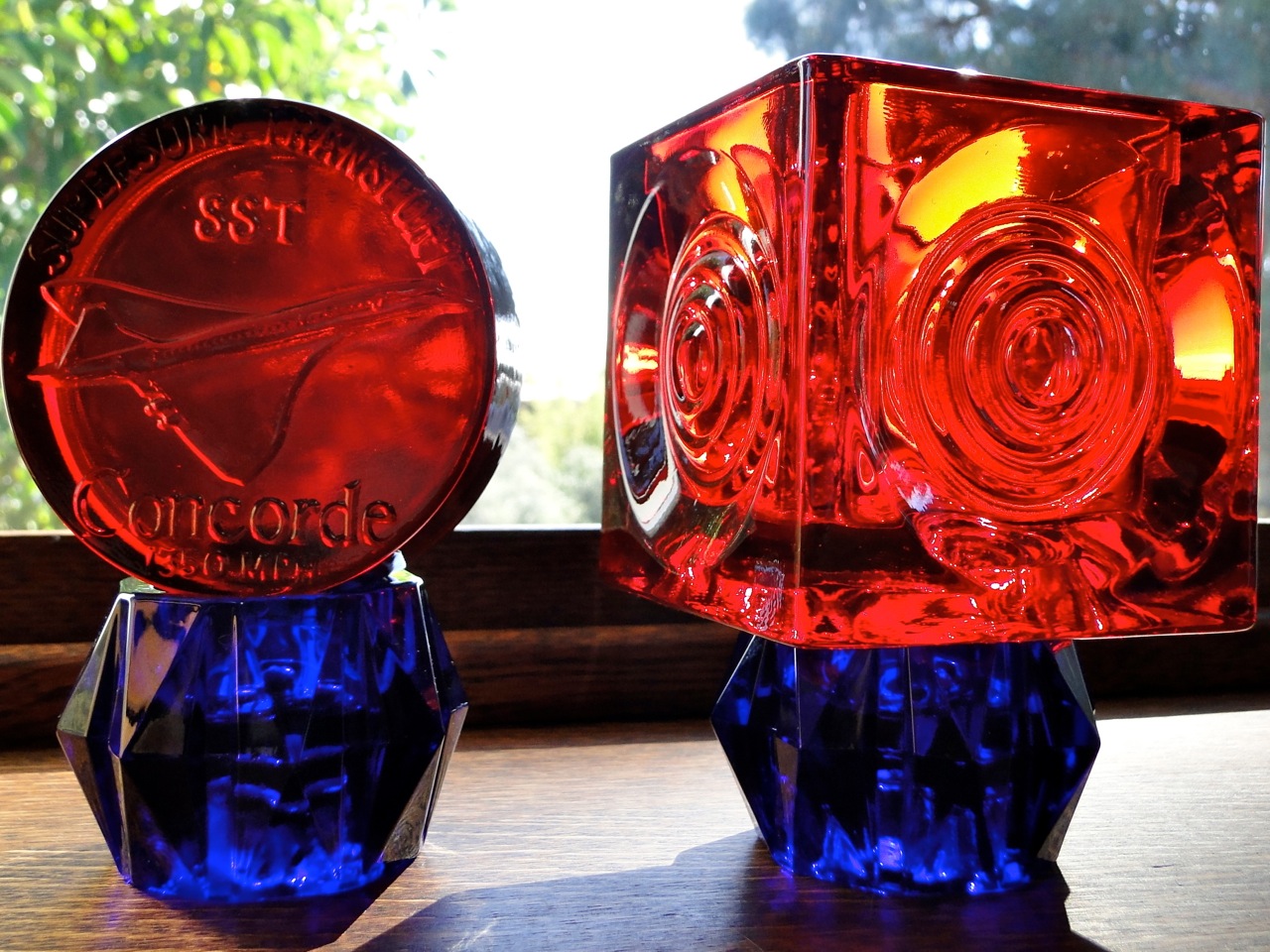
But I'm not fixated solely on blue. I've got a few favorite red pieces of glass too. The left one is a paperweight commemorating the development of the Concorde Super-Sonic Transport. The right one looks like a fresnel lens from a lighthouse, but it's "just" a square container. A container that turns to fire when the sun hits it.


I did a multi-part series about glass on my Excelmath blog, entitled It's Not Clear To Me. If you are interested you can read one of them [click here] or if not, just consider the following image:


Which watch to wear?

I have a collection of watches. People often ask me why, because You can only wear one at a time, right? That's not the point. You can only wear one pair of socks at a time and no one worries about how full their sock drawers are, do they? You can only look at a few paintings at a time, but most art lovers have many more than will fit in front of their eyes at once.


This morning before 6 am as I was reaching consciousness, I was thinking about which watch to wear. I don't normally sleep with a watch, although I know plenty of people who do.


Because I have many watches, it can take me a while to make up my mind. Today I chose the Reverso - the watch for the man who can't make up his mind.

For those of you who don't know this watch, it's built by Swiss watchmakers Jaeger-LeCoultre. Various models have been in production for about 75 years. It has one movement that can be turned over, either to expose a bare metal back (originally to protect the crystal while playing polo), a view of the movement, or a second dial.

I have only owned 2 Reversos. The first was called the Grande Date. It has an 8-day power reserve, which is a very long time for a watch to run on one winding. The power reserve is shown at the top left corner of the dial. A small seconds hand appears at the lower right corner. The date is shown in big numerals at the lower left corner, hence the name Grande Date. [click on any image to enlarge it]


You can see the movement through a transparent sapphire glass window on the back. I took these photos almost 5 years ago when I wanted to sell the watch. For symmetry's sake, I grabbed that dusty copper dish full of pennies and took another set of photos a few moments ago. My current JLC Reverso is called the Grande GMT.


The Grande GMT is more complex and expensive than the Grande Date. The front looks similar with small seconds at bottom right, and large date at bottom left. Instead of a power reserve at top left it has a day-night indicator at top right. This is necessary for the traveler, to know if it's day or night "back home."  The Grande GMT has a second dial on the back side of the watch, with 4 functions. 


The large center dial shows time in any time zone you wish. By pressing a button on the side, the hour hand is shifted ahead (top button) or back (bottom button) an hour at a time.

The smaller dial on the left displays the HOME location of the watch and how many hours that location is east or west of GMT (Greenwich, England). The bottom right dial is another day-night indicator for your second location. The power reserve indication is at the top right of this back dial. The hands and the 3, 6, 9 and 12 are luminous so you can check it in the dark in that strange hotel room...


I got both a strap and a bracelet with this watch, but I didn't like either very much. When I saw this custom strap that a friend had ordered (but didn't like) I knew I'd found the right one.


It is black water buffalo with white double-stitching, held closed by the JLC deployant (quick-release) buckle.


I don't know what led me to using this dressy watch as a prop in the garden rather than in an office situation, but I like the contrast and resulting photos. What do you think?


 In case the reversing part isn't clear to you, consider this pair of images. You slide the watch to one side, flip it over, and slide it back.


A few months ago I made this video, put it up on YouTube, and it's been viewed over 4200 times.

Thursday, February 2, 2012

Bright Colors, Part II

This blog is supposed to be about curating the art in our house. Today it has gotten out of control. I started with a definite theme in mind, but colorful foods have run away with me. As my publisher buddy Mike Bentley says, "There's often a story inside you itching to come out."

We've had a hard time getting our kitchen restored / remodeled / freshened / modernized. After working at it for 2 years, our friends see little success or outward change.

But we have learned a great deal about our house, and ourselves. Our 70-year-old kitchen is middle-of-the-road. It's neither tiny nor large, fancy nor plain. We have no fancy countertops, few electrical outlets and skimpy lighting.

However, the layout is well thought out. The location is excellent, facing south-east so the sun rises on our breakfast table. It's like the wheelhouse of a ship - we have an excellent view outside into the trees. Best of all, the bright white Corian counter serves as a blank canvas to highlight FOOD prepared there.


As a follow-up to my post on Bright Colors, here are some photos taken in our kitchen over the past five years. They were NOT originally intended to be published. The reddish tint in some is due to the dark wallpaper on the ceiling, and the brick fireplace.


Mushrooms are one of my favorite (and probably most expensive) ingredients. These came from several markets, and the front yard. This composition was very carefully arranged - mostly so that we wouldn't die of liver failure afterwards. I didn't eat the yard ones and didn't let them touch the others. 


This bunch of grapes came from the yard next door, and were the very first of the season. We were given these as a gift and told we could have more. Later in the season we jumped over the wall and snagged a few more bunches.


This assortment of food came from one afternoon's scavenging and picking (or picking up) from trees in our neighborhood. It helps that we are in an old part of town with lots of mature trees with branches hanging over the property line, and we have a Mediterranean climate.


Heirloom tomatoes really look good on a white surface. I took this picture because our local market was selling for $2.99 a pound and we couldn't eat more than this amount in a day or two, no matter how creative we were. [see below and click on any image to enlarge]


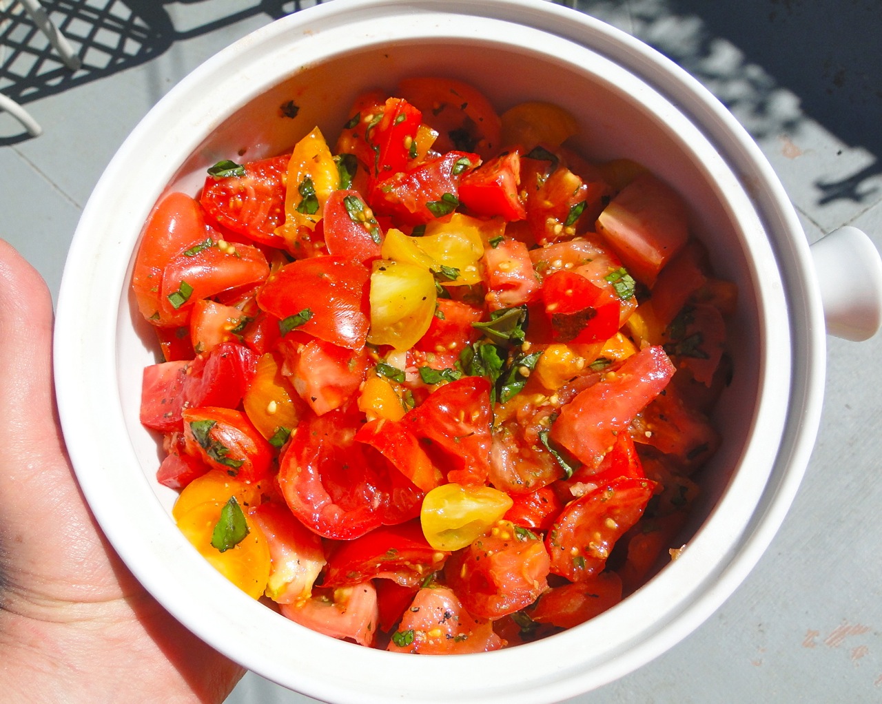
Jamie Oliver's mothership tomato salad is a big hit. It just takes a variety of fresh ripe tomatoes, a giant handful of basil, some olive oil, vinegar, salt and pepper.


Here are some of the fixings, with a watch of mine. Ignore the watch, for the moment. I can't go there today.


Here's a look at that salad. It's ready to be served on the patio for an autumn lunch.


If you drain off the excess juice, chill it and add a healthy splash of vodka, you can make yourself and your friends extremely happy.


Eventually the tomato crop runs out and we have to look for other colorful foods. (How do these watches keep sneaking in?) It appears that we have peppers and apples now.


This picture depicts the apples used to make just one pie in the manner we learned from my sister Kathy. She's a slow foodie from Seattle and has inspired my interest in pie-baking and old-fashioned apples.

This pie to celebrate a notable birthday was made from berries picked in our back canyon. This project contributed a lot of color to the Corian which we thought would be there forever (berry stains) but they came right up with some scrubbing.


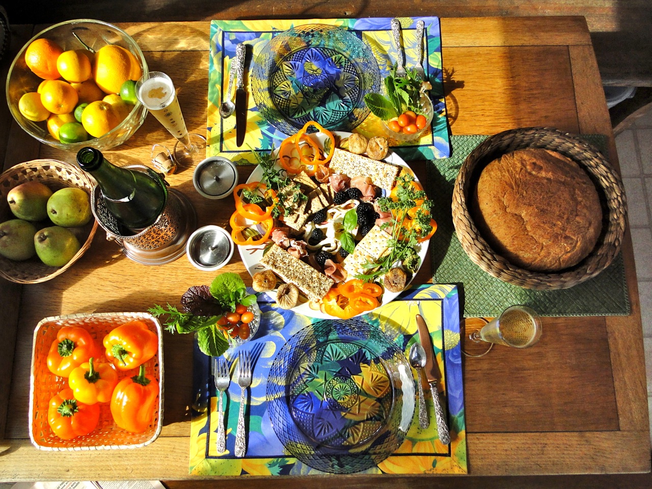
I had a lot more photos which I could have added, but this post is getting out of hand. And I am getting extremely hungry. I will finish up with this table full of food, prepared on that white Corian counter.


Wednesday, February 1, 2012

Why that one, and why there?

This is probably the most-frequently asked question a collector must handle.

Variations on the question include:
  • why that instead of this?
  • why that when this one is cheaper / bigger / brighter / newer?
  • why that instead of this one by a famous artist?
  • why that when you already have 2 / 11 / endless copies of the same thing already?
  • why did you hang it here?
Speaking only for myself - I find these questions irritating, but I think they can be answered.

Many purchase and display decisions are not entirely rational - they are driven by emotion, memory, intangible sensations of pleasure or pain - and they are hard to defend because you can't put all that into the mind of your questioner. You may want to share everything, or you may not. You might just want to look at the piece in peace!

CASE STUDY [click on any image to enlarge]

Le Pavilion II  by Kevin Blackham 

This is a collage built from old architecture books. We bought it at KD Fine Art, in Compton, Surrey. We have nothing else like it, and have never seen this artist's works since (the website). When I look at it, I end up half-way 'round the world in an English county, a decade ago, on a hot summer day.


THE CONTEXT
We were walking in Painshill Park looking for follies, and being chased by angry geese. Follies are peculiar buildings, constructed with no thought for practicality - grottos, towers, gazebos. Ted was our tour guide.


We explored lots of gardens that summer -  Painshill, Wisley, even the Chelsea Garden Show - but we kept on looking for follies. And we found plenty up and down the length of England.


We fell in love with Watts Chapel, in Compton, 50 miles south of London, and made several trips to explore the paintings, the gallery, the chapel, the cemetery and the neighborhood.


Sometimes it was hot. If we had explored up a terrific thirst, we went for the occasional drink down atthe pub.


And eventually, would stroll home quietly down the lane.


Anyway, in the middle of that summer, I bought this picture. Already framed. I took it back to where were staying and constructed a nifty crate for it. My friend Ted (shown here) is in a better place now and no longer with us. But I still have the crate. And the artwork.


That's why I hang this piece right there.


Sunday, January 29, 2012

What is it about Bright Colors?

I feel that it's time for a colorful post. I'm going to run my curator's eye over a collection of bright and brilliant art that we have assembled. Bright colors appeal to me. (Is it genetic? inherited from the Mexican side of my family?)

I like these flowers assembled for my mother-in-law's memorial service.


And this rubber Michelin Man clock I got in Paris about 20 years ago.


Our friend Joe Nyiri is a Wisconsin-born but San Diego-loving artist who has had a long relationship with the San Diego Zoo. He paints, sculpts, welds, and plays tennis. Here he is showing his customary attitude towards the world.


We got our first Nyiri artwork by accident - won in a raffle at my wife's school. Joe had donated this piece for the school's annual fundraising campaign. I had no idea what it was about. I wasn't sure I liked it. I tried to give it back.


But we took it home and hung it up in the bedroom. When I get that feeling "I'd rather gouge my eyes out than go to work, or do the dishes, or ..." this painting makes me think twice. "No, eye gouging won't help."

A few years later Joe invited us to his annual painting sale. He does dozens of artsy animal pieces, then sells them out of his back yard on the Friday after Thanksgiving (when real shoppers are at the mall). About 10 years ago I bought this goat with my own money. No raffle, no pressure. Some people think it's a dog, but Joe and I agreed it's a goat, so GOAT it is. I liked the ear assymmetry, and the attitude. I also like the aggressive brush strokes.


The Cat came the following year; chosen for the blue-green-purple color range and its expression (we've had cats for 35 years).


Then the Crow, I think, chosen primarily for the explosive orange-red. I don't really like crows, but lots of visitors to our museum home seem to.


This "Dog" joined us this Fall, although Joe painted it about 10 years ago. Personally, I don't think it looks much like a dog, but I liked the color themes in its hair. I failed to buy it at least 5 times before, but this year it grabbed me, and it complemented my new hanging scheme.


The Berkshire Pig was painted outside a field where the "model" pig resided. This was purchased for the yellow-orange tones, and his thoughtful eyes and set of his mouth and chin.


This Dog is named Iris. It looks like a Dingo to me, and it's not afraid to stare right back at you without giving away a clue as to its thoughts about you.


I like the bright green tones of this Cow and its friendly face.


These are baby Cooper's Hawks. Joe painted a whole series of Cooper's Hawks as a memorial for the parents of a young boy named Cooper who died recently.


These two Crows were our most recent purchase - chosen primarily because we liked the way Joe painted the branches down and over the edge of the picture frame, and secondarily because they would fit nicely at the top of our collection. We're almost scraping the ceiling, but that's ok with us.
The collection looks approximately like this today. We have it in our main hallway so we can enjoy it as we run up and down the hall. It's hard to get a photo of all the pieces together because you can't back away enough, even with a wide lens. (The painting of two birds looking down was taken back and traded in for a new image.)


As you can see, we have a wide range of colors. Since the color tones run freely up and down and across each painting, I have enjoyed the challenge of moving them around in this composition - to get a mix of vertical and landscape formats as I blended the colors and shapes across the whole wall.


Leaving Joe's works beyond us, we move on to the following painting which also came from my wife's school. Painted on butcher paper for a school play, it lay in a cupboard for more than 10 years. The principal found the picture and put it up for auction. I failed to win the auction, but the high bidder let me make a digital photo and we printed a life-size copy.


I used to hang it at my office, but some ladies complained that it was too spooky - glaring at them all day - so we brought it home. It's 20 x 30 inches and has real presence.


My wife found this fish scene in a different closet at school. The upper corner was missing, and kids had inked grafitti on the bottom, but I wanted to keep it. We asked Joe to repair it, and several other painters, but they all said "Not mine, I won't touch it." So I learned something valuable about painters ... and I decided to restore it myself.  I glued some heavy paper into the corner and let it dry. Then using paints left over from my mother's "painting phase" I covered up all the grafitti, and touched up the rest of the scene. Here's the result:


I'm could go on and on, but I will finish now with a piece that I love very much. I bought this in 1988 on our first trip to Europe. It's a Swiss school poster entitled "Dangers of Disorderly Traffic." It was designed to teach kids how to behave safely around crowded intersections.


It shows everything they could do wrong (incentive to fool around, I think). It's been hanging directly across the room from my desk for the last 10 years.


We have another 50 or 60 pieces of art that do not have bright colors. I'll get to them someday soon.